• Home
  • Web Design
  • WordPress
  • E-Commerce
  • Portfolio
  • About
  • Blog
  • Contact
Notting Hill Web Design

Pretty Ugly Sites

line

While I had stated a couple of weeks ago that looks aren’t everything, it has to be said that this statement is only true to a certain extent and there are some very obvious exceptions.  When looking at the following sites, be sure to be equipped with sunglasses and aspirin.

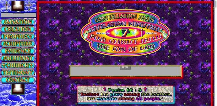
constellation7

constellation7.org is possibly one of the most torturous sites to look at and to navigate. All the pages, navigation buttons, and sidebar offer a number of multicolored, neon backgrounds. The neon theme is also reflected in the site’s images and texts. A lot of effort would have had to be made to make this site so ugly. Each page has a totally unnecessary sound clip with no option to mute the sound on the site. I cannot imagine that visitors will want to spend much time on here.

While I had stated a couple of weeks ago that looks aren't everything

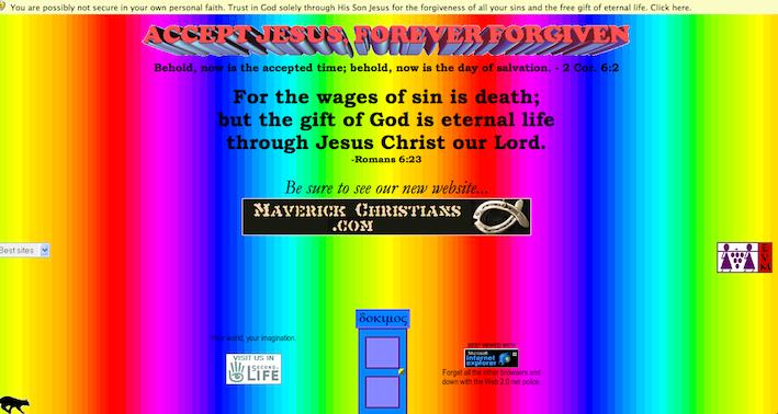
There seems to be a pattern emerging with Jesus and Neon. After you overcome the dizziness of dokimos, you can see the link to their new site, which is quite a relief.

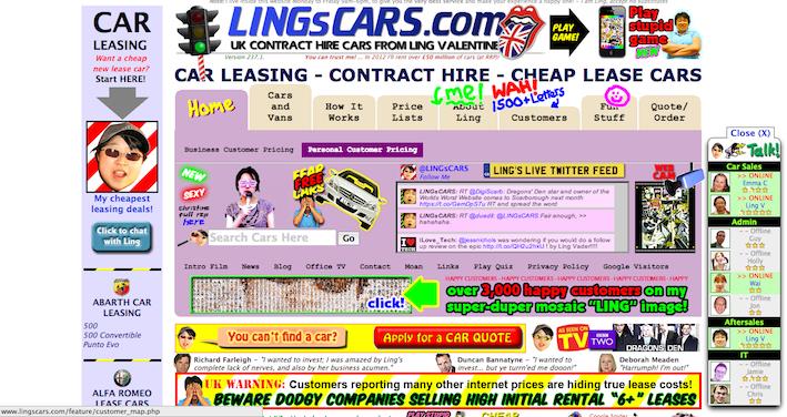
lingscars

Lings cars from Dragon’s Den has a website that is both funny and ugly. It has all the flashing images and texts, too many colours and different fonts however she has made some funny images of herself and I would tell her personalty and sense of humour is accurately translated here. The site isn’t actually that hard to navigate but there are far too many distractions.

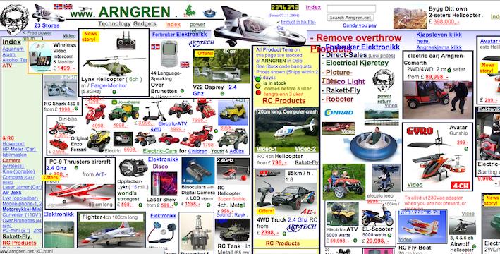
argren

Arngren‘s information overload of ugly overlapping images and text makes you want to leave the site instantly. I think this site sells stuff but, would you trust them?
Pretty Ugly Sites

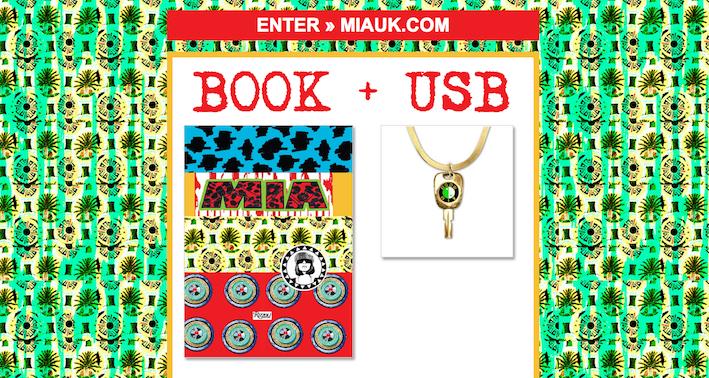
M.I.A’s intro page and main site has bright colours and prints, much like her personal style. Not sure if it is  that acceptable in reality or the virtual world.

So here we have it, examples of how looks can matter. A lot of time and money would have had to be put into making these sites ugly. The saying ‘less is more’ should be considered when designing your site.

Kimia

  • Posted in:
  •   

Post navigation

Previous post Previous post:
⟵ What you must consider for your web design
Next post Next post:
Office Secret Santa ⟶
  • Home
  • Web Design
  • WordPress
  • E-commerce
  • Portfolio
  • About
  • Blog
  • Contact
  • Sitemap
Copyright © 1999 - 2021 Notting Hill Web Design All Rights Reserved.
We use cookies on our website to give you the most relevant experience by remembering your preferences and repeat visits. By clicking “Accept”, you consent to the use of ALL the cookies.
Accept Decline Read More
Manage consent

Privacy Overview

This website uses cookies to improve your experience while you navigate through the website. Out of these, the cookies that are categorized as necessary are stored on your browser as they are essential for the working of basic functionalities of the website. We also use third-party cookies that help us analyze and understand how you use this website. These cookies will be stored in your browser only with your consent. You also have the option to opt-out of these cookies. But opting out of some of these cookies may affect your browsing experience.
Necessary
Always Enabled
Necessary cookies are absolutely essential for the website to function properly. This category only includes cookies that ensures basic functionalities and security features of the website. These cookies do not store any personal information.
Non-necessary
Any cookies that may not be particularly necessary for the website to function and is used specifically to collect user personal data via analytics, ads, other embedded contents are termed as non-necessary cookies. It is mandatory to procure user consent prior to running these cookies on your website.
SAVE & ACCEPT